Whenever you notice the illustrious Swoosh sign, do you need someone to spell out Nike to recognize what it stands for?
Probably not!
Research shows the average person on any individual day is exposed to over 2000 brand logos and taglines. That’s EVERY DAY!
The visual identity of your organization can make or break your brand in the eyes of consumers.
Establishing and creating a successful brand image demands a lot of tenacity and perseverance. One needs to take into account several factors to ensure that your brand hits the right chord with the consumers.
This article is from a designers perspective on how to create an unforgettable identity for your brand. Go on and give it a thorough read as it could serve as a holy grail for you.
What does the word ‘Brand’ truly mean?
The word “Brand” is often misinterpreted. Some believe a brand is just about the logo or maybe the advertisement campaign. Although these are components of creating a brand image, they are definitely not the whole thing.
Seth Godin, an American author, and a former dot-com business executive define, “A brand is the set of expectations, memories, stories and relationships that, taken together, account for a consumer’s decision to choose one product or service over another.”
It is a whole experience as well as an emotion for the consumers connected to a service provider or organization.
What is Brand Identity?
Source: underconsideration.com
Brand identity is the visual aspect of a brand which covers all the elements that are being presented to a consumer to portray the company’s precise image. It is the visage of a brand that instantaneously makes consumers identify and mentally associate with its products and services.
Basics of Brand Identity Design
1. Color Palette
 How important do you think, a naive color palette can be to a brand?
It is so significant that the specific hues utilized by a brand can be copyrighted and protected by law. A single color can be used in a brand so long so that the consumers associate it with only that particular brand.
Colors portray emotions and personality. Thus, while creating a color palette – the brands’ values and emotions which are trying to be projected should be kept in mind.
Colors can represent the nature of the product
Here are some colors and the emotions that they express:
- Red

Red symbolizes passion, love as well as excitement. If your brand wants to convey emotions like – bold, loud and youthful – then red is the ideal choice for you. Examples, Target, CocaCola, Zomato, etc,. - Orange

Orange represents high energy and friendliness. For Example, Fanta, SoundCloud, JBL, etc,. - Yellow

Yellow is the color of luster and portrays happiness. The use of different shades of yellow can represent various emotions; lemon yellow being cheerful & natural, and golden yellow being luxurious. For Example, Mac Donalds, BestBuy, SnapChat, etc,. - Green

When people see green, they usually think of either of the two things – Money or Nature. If your brand wants to be defined with either of the two, green is definitely a good choice. Moreover, green is also the color of neutrality and serenity and can be deployed in the medical sector as well. For Example, Starbucks, LaCoste, Android, etc,. - Blue

Blue can make your brand appear more trustworthy and stable; therefore it should be utilized when you are trying to reach a wide demographic. For Example, Facebook, Twitter, LinkedIn, etc,. - Purple

Purple, the color of royalty brings a luxurious touch and feel in the company’s branding. For Example, Cadbury, BenQ, Taco Bell, etc,. - Pink

Pink is culturally and stereotypically tied to feminity. Therefore, if a brands’ target audience is women, pink should be considered. For Example, Barbie, Baskin Robbins, etc,. - Black:

There is no more minimalistic and sophisticated color as black. It represents class. When used in the combination of white it gives a unique depth to the whole picture. For Example, Apple, Nike, Chanel, etc,.
2. Typography
Typography refers to the type of font and the various usage of its weight. There are basically four variations in typography:
- Serif
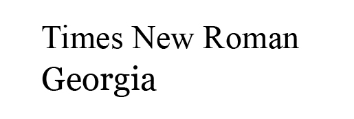 These are fonts that have what looks like an anchor or stroke on the end of each letter. It is a little old school and classic. Used popularly in publication branding.
Examples: Times New Roman, Georgia, etc.
- Sans Serif
Sans meaning ‘without’ are Serif fonts that don’t contain a stroke or anchor, and have smooth edges. Sans Serif appears more contemporary and modern.
Example: Helvetica, Franklin Gothic, etc.
- Script
The cursive handwriting everybody learned at elementary school is the script typography. It provides a feminine and luxurious touch to your branding.
Example: Allura, Pacifico, etc. - Display
Display fonts have their own place in typography and are more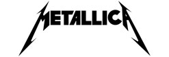 of a specialized hand-made font. They can take unusual shapes and forms, maybe outlines and shadows too. These fonts create a bold statement in the minds of the audience. One can think of a metal band logo like Metallica as an example.
3. Shapes and Form
Shapes and form can make or break your brand Identity (pun intended).
Here’s how:
- Round shapes
This covers shapes like circles, ovals, ellipses, etc. They give the feeling of warmth and fuzziness. Brands associated with community and unity uses these shapes. A perfectly round shape or circle can also indicate infinity because of its absence of corners and symmetry from all of its sides.
- Closed Edged Shapes
These types of shapes encompass triangles, squares, rectangles, pentagon, hexagon, etc. The corners represent strength and efficiency. It is also stable and therefore trustworthy.
- Straight lines
Open-ended straight lines have their own connotations depending upon their type. A vertical line suggests masculinity, strength, and virtue while horizontal lines indicate calmness, rest and smoothness. Diagonal lines give a theatrical effect as if they are holding something up.
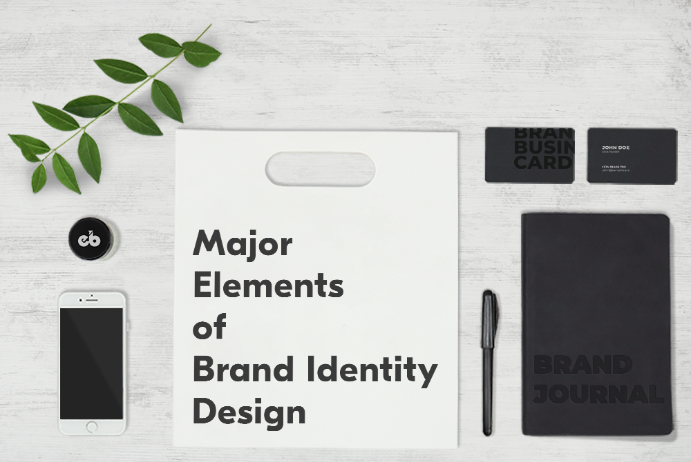
Major Design Elements for a Strong Brand Identity
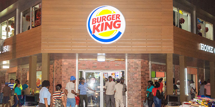
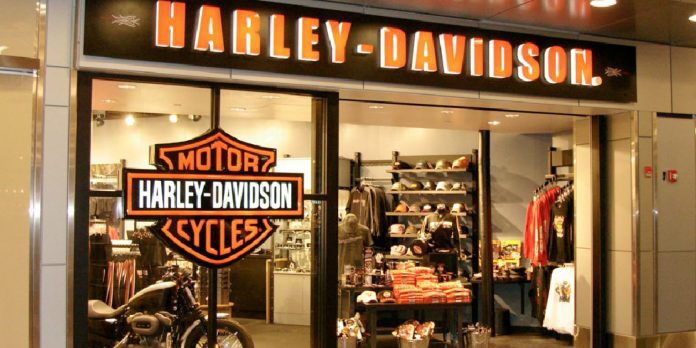
1. Logo
A logo is literally the face of your company. And unlike human faces, it could be improved and edited – without requiring any cosmetic surgeries! Logos for a brand are like signatures of a person. It works as the identification as well as a visual aid for the audience to associate with services an organization provides.
For instance, when you see the “golden arches” your first thought is probably the delicious Big Mac and crispy fries.
When you see Googles’ logo, you instantly think of search.
That’s the strength of an incredible logo. It can influence and trigger how you feel about a company and the products or services they provide.
Following are some broad categories of logos:
- Monogram/Lettermark
Which is easier to remember – Entertainment and Sports Programming Network or ESPN? Lettermark or Monogram are typography based logos which utilize just the initials of a brand name. It streamlines the company brand in case it has a long name and indicates simplicity. If yours’ is not a well-established brand, consider writing the whole name below the logo.
- Wordmark
This is also a typographic logo like monogram but uses the whole name instead of acronyms. It can work really well if a company has a unique and peppy name. The logos of brands like Coca Cola or Google – If the brand name is catchy enough, then a wordmark logo is a cherry on the top.

Source: digitaltrends.com
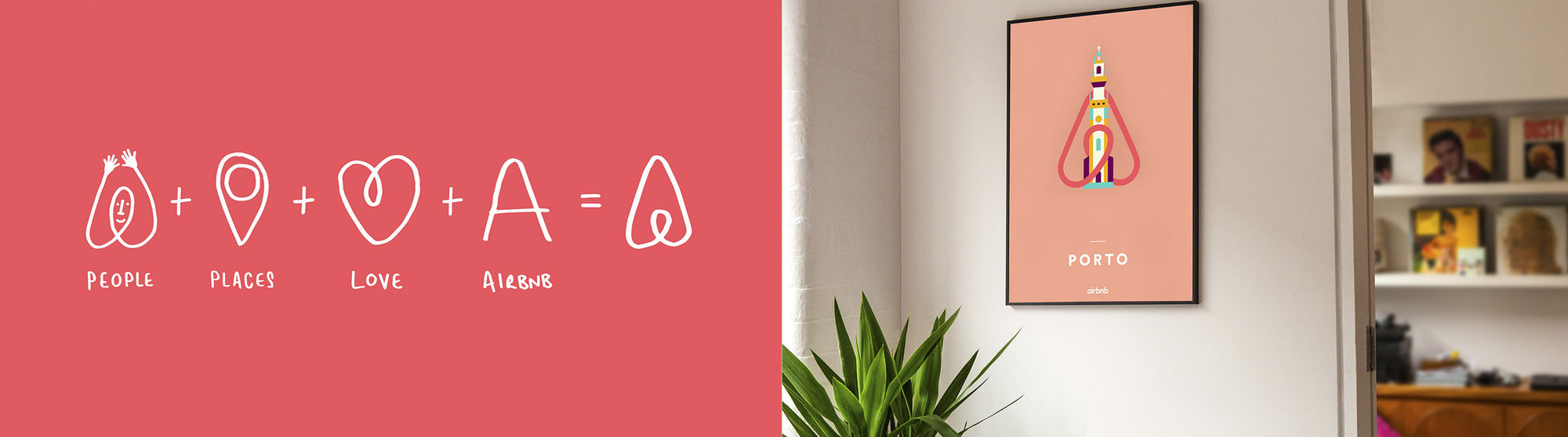
- Pictorial Mark
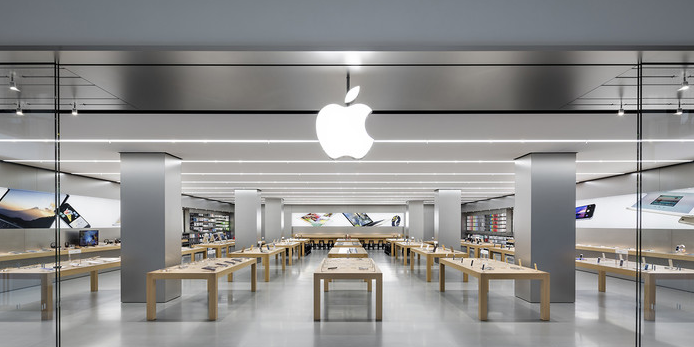
Apples’ simple, minimal and highly recognizable logo is one of the best examples of pictorial mark logo. Basically, it is a unique and straightforward representation of the brand. Pictorial Marks, if used long enough, can be embedded in thoughts of users to the extent that they don’t need the brand name written anymore. The biggest challenge in designing such logos is deciding which shape to use as it will stick to the company’s identity for its whole existence. Something simple but effective should be thought considered. Try and play with the names, think of the functionality or look to arouse an emotion.
- Abstract Logo Marks
It is a form of a graphic logo, which isn’t as simple as – Apple’s – Apple or Twitter’s – Bird. It is more of a complex and abstract icon that has a more profound significance. These types of logo give an opportunity to represent something unique as the brand’s image.
- Mascots
Mascots offer a unique way for customers to be associated with a brand. They are fun and playful representation of the culture that the organization imbibes. They are most often used to represent big events which involve worldwide participation, for instance, the SuperBowl, Olympics, etc,.
- Combination Mark
The name says it all. It is a combination of the visual and typographic form of the logos. The picture and the text can stay side by side, or stacked on top of each other or even designed in such a way that it creates an altogether distinct image, like that of Doritos.
- Emblem
Think of badges, seals, and crests. It consists of text written inside an icon. It is often used in the logos of educational institutes. They provide the brand with a traditional image, simultaneously striking a chord with the consumers. The Starbucks Coffee’s mermaid emblem logo is an excellent example.
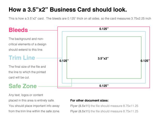
2. Business Cards
A business card is the most natural means to make your customers reach you.
Keep it clean and only include information that is necessary. Include a logo that is visible enough, the name of the contact person and ways to connect with him/her.
The standard molds for a business card are as follows, though their sizes and shapes can differ according to requirements.
- US Horizontal Cards:5×2 Inches
- European Horizontal Cards: 85×55 mm
Printables’ Guide:
- Keep document mode to CMYK.
- Keep it a high resolution (300 dpi).
- Keep the trim, bleed and safety lines marked.
 3. Packaging
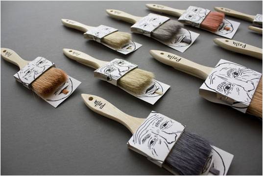
If a company’s services are product based, good packaging design is essential to establish a good brand image in the heads of consumers. Packaging is one such element which involves considerably lesser investment as compared to advertising but can reap the same benefits. It is an excellent opportunity to attract clientele and enhance their experience. Whether it is the packaging of a mail cover or the design of a Smartphone box, nothing should be ignored.
4. Website
The dawn of the 21st Century introduced us to the digital era. Therefore our branding efforts should get digitalized as well! Nowadays, customers tend to search and visit a brand’s website to create a mental image of how your organization is. A good site is critical, especially if the organization is running an online business or selling digital products. Therefore, this tool should be utilized in full force to convert leads into customers.
5. Stationeries
Designing stationeries is probably the most enjoyable and fun part. Not only one can experiment with the design and creativity, but also the quality of material such as paper and ink. Stationeries include products like letterhead, diaries, journals, pens, envelope, calendars, flash drives, etc. Keep the printables’ guide in mind while designing.
Creating a Brand Style Guide
The guide to proper usage of your brand identity elements is as vital as designing them because, in branding, consistency matters a lot. For that, a company should always specify how its different assets should be employed in a document called a Brand Style Guide. It outlines and explains the do’s and don’ts of various design elements of the company.
Wrapping Up
In the vast pool of competitors – Your brand identity is what makes you stand apart.
It should clearly convey what you are, what you do and what makes you unique amongst everyone else. Designing a good identity is thus crucial to show a brand in a positive light.
Designers at EngineerBabu possess solid expertise in creating exquisite branding elements for our customers. We are renowned for designing super quirky and exciting logos, as well as other branding elements. With years of experience in designing and shaping some very recognizable branding elements, we’ve been able to win several accolades. Check out our portfolio, right here and Contact us for a free consultation.